Pantone’s 2015 Color of the Year

Pantone has decided on the rich, rusty red color of Marsala to be this year’s Color of the Year.  This color is named after a red wine and embodies that rich flavor and taste.

Pantone describes it as a “hearty, yet stylish tone [that’s] universally appealing and translates easily to fashion, beauty, industrial design, home furnishings and interiors.”

I think this color is very different from that of the previous years because it’s much less extreme and more subdued.  I feel that this color is able to reach across a wider audience of design as opposed to just fashion.  It’s subtle enough to work through all areas of design because it pairs so well with so many other colors.

It will work well for both men and women, creating warm feelings in home interiors, and adding a touch of luxuriousness to anything it’s used in.

I would love to incorporate this color into one of my designs, as I feel it is a color that enriches existing life.

“Marsala enriches our mind, body and soul, exuding confidence and stability. Marsala is a subtly seductive shade, one that draws us into its embracing warmth.”  -Leatrice Eiseman, Executive Director, Pantone Color Institute

Bolger Printing Class Tour

On Thursday, March 26 our class was given a tour of Bolger, a printing services company with a local location, but international recognition.  I was immensely impressed that such a well renowned company is located just blocks from my house!

Dik Bolger, owner of the company, gave a great tour of the facilities, an overview of the products and services they provide and some insight into the printing industry.  I really enjoyed the tour from his perspective because he was able to take credit for everything the company has to offer and has accomplished as well as be able to say, “my printers, my employees, my company.” I’ve never had a tour be given by the company’s owner before and it was nice to be able to see how invested he is in the whole operation.

I was mostly impressed with the innovation this particular company uses in their products and services.  They have an immensely massive roster of important clients, both at home and internationally, and they treat each with unique care and innovation. Dik showed us some examples of work they’ve done for major clients and the fact that a printing company also created boxes designed special for Captain Morgan’s bottles and flasks was so cool!

I guess I always imagined printing companies to just be big warehouses full of printers and boring people sitting behind cubicles, but Bolger showed me differently.  I learned that there are creative teams, sales people, technicians, designers, etc., and they make up a wonderful team of people making interesting work.

It was fun to get out of the classroom and see where our work could, potentially, end up!

My favorite typeface

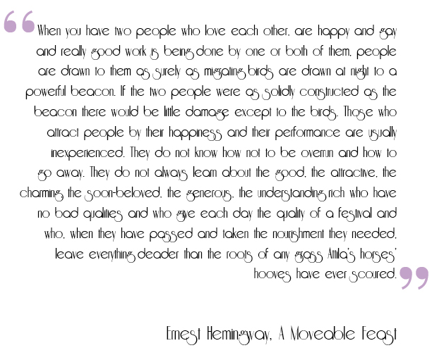
I thought it might be interesting to share with you my favorite typeface.  It’s a retro font called Riesling.  I found this typeface when searching through designer blogs for our first project, the bumper sticker.  I haven’t been able to use it in a project yet, but I find it to be absolutely beautiful.

It has that 1920s glamour look, something that I’m obsessed with.  All my favorite authors, artists, novels, etc. come from the twenties and I love that this typeface embodies that.

I think this typeface would be useful in a poster or publication with a retro look or displaying something from the time period it represents.

I’ve rewritten an excerpt from my favorite novel, A Moveable Feast by Ernest Hemingway, in Riesling to highlight this typeface’s beauty.

hemingway

Jessica Hische – Bold Typeface Extraordinaire

After delving through the creative blog, I came across the work of this contemporary designer, Jessica Hische.  I went through her website extensively and have come to the conclusion that she is the master of using bold typefaces, like in this book cover below.

01

Just by looking at her website (jessicahische.is), you can tell that she chooses to use bold, elegant typefaces in the majority of her designs.  She does a lot with typography, mostly designing for book covers, advertising and identity.

She has most recently done some advertising designs for Starbucks, incorporating typography to sell the ingredients of different types of lattes.  Her typefaces were made into physical food items and then photographed for posters.  It’s pretty neat!

My favorite work of hers is the film titles she did for the Wes Anderson movie, Moonrise Kingdom. They’re so simple, unlike a lot of her work, yet blend so well with the overall aesthetic of the movie and Wes Anderson’s overall style.  I was truly impressed and excited to learn about these designs, mostly because I’m a huge Wes Anderson fan!

1012

Jessica Hische designs in a way I can relate to.  I think her aesthetic is really cool, and her bold choices work well with the color palettes she uses.  She’s definitely a designer to keep an eye on!

Alex Steinweiss was truly an inspiration.

After working on the designer project for about three weeks in class, I really came to understand and appreciate the work of my designer, Alex Steinweiss.  He was named the creator of the modern album cover and designed more than 850 covers for Columbia Records during the 40s and 50s.  His iconic work really changed the music packaging industry for the better.

I think I was drawn to Steinweiss’ work because of how vastly different and versatile all the designs were over the years.  He created so many album covers, and yet each one felt unique and special to the music it was representing.

I also love the fact that I now see his designs when I go record thrifting.  I am an avid listener of old records, owning a turntable and collection myself, and being able to now go to a vintage record store and pick out an album from his generation and say “Hey, this is Alex Steinweiss’ design!” is pretty cool.  In fact, I just did that last weekend.

I think Steinweiss’ designs were an important feat for the music industry because, without him, we may have still been listening to vinyl that was placed in boring, paper sleeves.

Excellent typography in my daily commute

Every day, I pass by this wall of painted black brick on the corner of Como Avenue and 15th Avenue Southeast.  I live about 5 blocks from here and I either drive, bus, walk, or bike past it on my way to campus.

This wall is home to Black Coffee and Waffle Bar, a newer establishment as of summer 2014.  The place is great.  Trendy and specialized in, you guessed it, waffles and coffee.  I’ve had some pretty dang good waffles (although moderately overpriced) at this hip cafe.  But what’s most striking and memorable about this business is their eye-catching exterior.

It’s so starkly different from all the other establishments in this area, as it is much more modern and aggressive in its attempt. The contrast between the black and white makes it stand out to anyone in the vicinity.  The typeface itself is very attention-grabbing, as it’s in all caps and has a fun flair in the word “and.”  The simple block letters and clean white line around it makes for a sleek look.

I find this wall to be entirely brilliant.  I see so many people inch into the street in the absence of cars to take photos of each other in front of, what’s becoming, the iconic “Black” wall of Como.

I think this is a perfect example of how to excellently use typography to both enhance your business’ exterior and brand.

Helvetica is everywhere.

After watching the 2007 independent documentary Helvetica, I was amazed to discover just how present this typeface is in our society.  So many (and by so many, I mean a heck of a lot) of brands and designers use this simple, timeless typeface!  And to be honest, it is still very much relevant and contemporary.

I loved hearing from seasoned graphic designers and their experiences with incorporating the typeface into some of their past designs.  I think that there was definitely a craze in using the Helvetica typeface, but what I think is most surprising is that it’s still being used even after the hype died down.

I was most inspired by how personal the stories were for some of the designers and their relationship with Helvetica.  I think Massimo Vignelli’s story was the most touching.  Not only was this sweet, old Italian man adorable, but he had some really great insight on the typeface and its use in design.

Overall, I thought this film was really well shot and gave some great unknown information on the typeface Helvetica.  I enjoyed learning about it’s history and getting inspired by typography.